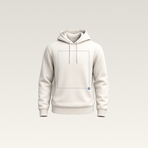
 mockup
Sweatpants give a graphic a long, narrow surface interrupted by pockets, the knee, and the cuff. Decide whether you need a compact thigh logo or a graphic that travels down the leg before fine-tuning the position. Compare both on the same silhouette so the design decision stays separate from the fit of the model.
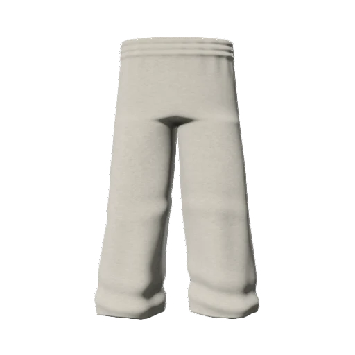
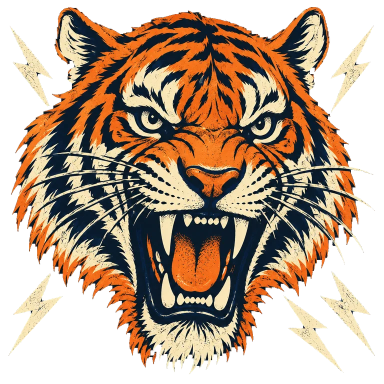
Choose the graphic’s role first, label the wearer’s side clearly, and confirm physical placement on the actual product rather than measuring a render.
1. Choose a silhouette that matches the idea
A tapered jogger, a straight sweatpant, and a wide-leg style offer different proportions. Look at the waistband, pocket shape, leg width, and hem before placing the artwork. A large graphic on a narrow tapered leg can feel cramped near the cuff even when it looks balanced at the thigh. Compare the preview with the exact blank or supplier reference you intend to use.
If the available model differs from the planned garment, treat the image as a concept and keep that difference in the brief. Changing the artwork scale does not change the cut of the pants. Keep a front view for clarity and an angled view for checking how close the graphic comes to the visible side of the leg.
2. Compare a small mark with a deliberate leg graphic
Start with a compact thigh mark that has enough space around it to remain recognizable. Then try a separate concept with a vertical wordmark or illustration. Keep the same artwork family, garment color, camera, and lighting. You are comparing two compositions, not trying to make a small logo behave like a long stripe by stretching it out of proportion.
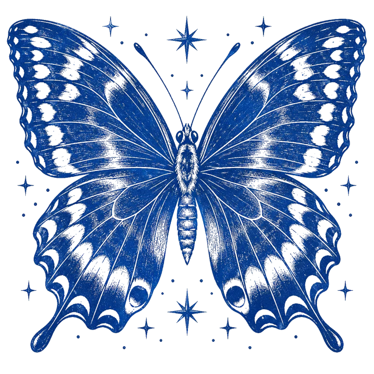
Judge the visible artwork instead of its bounding box. An image with large transparent margins can seem aligned while the actual lettering sits too close to a pocket. Trim unnecessary margins in the source file and re-import it if the placement feels difficult to judge. Preserve the original artwork separately from the project.
Prepare a clean transparent graphic3. Make side and reading direction explicit
The wearer’s left leg appears on the right in a straight front view. Write wearer’s left or wearer’s right in the approval notes instead of relying on the image alone. For vertical text, decide which direction the letters should read and keep that decision consistent across the set. An ambiguous screenshot is a poor substitute for a short instruction.
Check the actual words and their order after rotating or flipping a layer. A decorative arrangement can look balanced while making the name awkward to read. Use a simple test phrase first, inspect it at normal viewing size, then replace it with the final artwork. Recheck the final lettering rather than assuming a placeholder proves the whole composition.
4. Inspect pockets, knees, and the hem
Look for any important letter or part of the logo that approaches a pocket opening, seam, or the lower hem. A long graphic can look continuous on a static front view while wrapping away from the camera near the sides. Do not rely on an angle that conveniently hides the difficult part. Compare a clean front view and an angle with the same framing.
The model does not establish how the real pants fold when someone sits, walks, or bends a knee. Use it to narrow the visual options, then inspect a sample where those changes matter. The supplier’s decoration area and method determine what can actually be made. A generic preview does not authorize printing over every seam or panel.
5. Build and compare the concept on your phone
Choose an available joggers model in 3D Mockup, import the prepared graphic, and adjust its size and position. Rotate the garment to inspect the composition. Keep lighting unchanged while comparing a lighter and darker fabric color so you can judge the artwork’s contrast rather than a change in the scene.
Save the chosen project and export the relevant views. Open the files outside the editor and check that the full leg graphic remains visible in the framing. Name each image with the garment, color, wearer-side placement, and version. The app helps communicate the idea; the export is not the original decoration file or a physical sizing template.
6. Send a placement brief that can be checked
Attach the original graphic, exact product reference, and selected previews. Ask the supplier which physical dimensions and placement references it needs. Keep unresolved choices separate from approved ones so an attractive alternative does not accidentally become the production instruction. Confirm the decoration method for that specific garment before preparing the final files.
Review a sample against the brief, including the logo’s readability when the pants are worn. Check the intended sizes rather than assuming one digital model represents the full size range. Record any changes to the graphic dimensions or position, and update the preview and brief together before approving the next version.
Quick answers
Are joggers and sweatpants mockups interchangeable?
Only when their silhouettes suit the intended product. Check leg shape, pockets, waistband, and hem rather than assuming that changing the title makes one model match another.
Can the mockup tell me the exact print size in centimeters?
Do not infer production measurements from a perspective image. Confirm the physical graphic size and placement using the actual product and supplier’s references.
Further reading
Supplier example showing that styles, placements, and decoration methods vary by product. Use the specific item’s requirements.
Published by 3D Mockup. These guides explain a mockup workflow, not manufacturing specifications. Studio access requires a subscription; AI artwork generation uses credits.