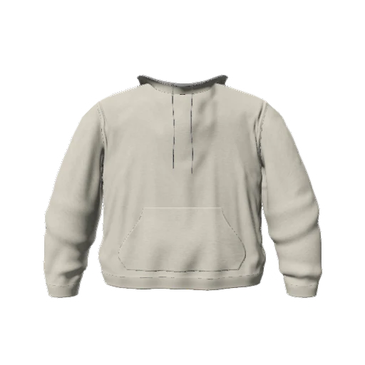
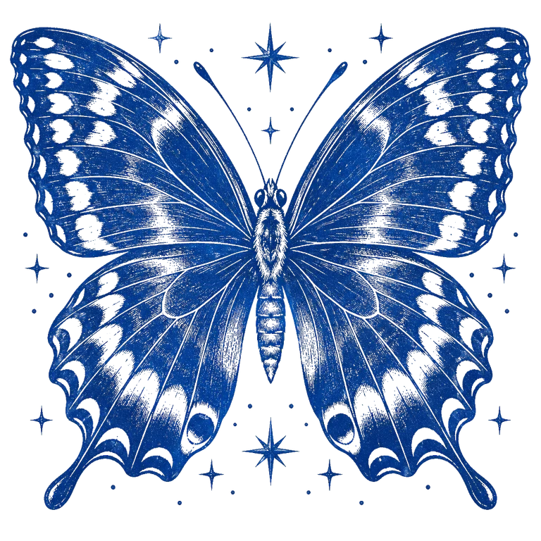
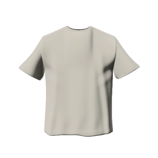
 mockup
A colorway mockup set shows the same design across different garment colors. Keep the artwork, camera, background, and lighting consistent so the comparison is actually about color. Start with a small set, check contrast, and export only the variations that communicate your idea clearly.

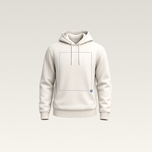
Change one variable at a time. Colorway comparisons are useful only when the placement and presentation stay consistent.
Finish one master design first
Choose a garment, place the artwork, and check the front and back before adding a palette. If the graphic is still moving between versions, you are comparing both placement and color at once. Finish a strong base version and save the project.
Keep the original artwork available. If the dark colorway needs a lighter logo, make a deliberate artwork variation rather than trying to rescue an unreadable design with a lighting effect. Name the variation clearly so it does not get confused with the original.
Check your artwork's transparency and contrast firstStart with a small, intentional palette
Pick a light neutral, a dark neutral, and one accent color as a first comparison. This is a design exercise, not a requirement to sell all three. A small set helps you identify whether the artwork only works on one background or remains readable across the range.
Do not assume that an on-screen garment color exists as a purchasable blank. If the collection is heading into production, match your final choices against the supplier's actual options and inspect physical samples when color matters.
Keep the presentation identical
Use the same angle, framing, lighting, and background for every color. A brighter light or tighter crop can make one version look more appealing for reasons that have nothing to do with the garment color.
Use a front view to compare the main graphic. Add a back view if it carries important artwork. You can also make a separate angled presentation image, but do not substitute different angles into the basic color comparison.
- Same artwork position and scale
- Same view and framing
- Same lighting and background
- A readable design on every selected color
Preview and export a colorway pack in 3D Mockup
Open the colorway export flow for your design, choose the available garment colors and views, and generate a preview. Inspect that preview before creating the finished pack. If you change the design, generate a new preview so the exported set reflects the latest version.
The pack brings the rendered images together in a ZIP for sharing. Use the device's share options to place it in your chosen destination, then open the completed files to check that the selected colors and views are present. Save the editable project separately if you will continue working.
Make the set useful to the next person
For a collaborator, show a compact side-by-side comparison and identify the preferred version. For a product concept, keep the images clearly labeled as mockups until you have verified the actual garment and finish. A consistent presentation is more useful than a large pile of slightly different renders.
Keep a distinction between concept colors, final supplier colors, and print artwork. The exported mockup is a communication tool. It does not confirm fabric availability, color matching, or the manufacturing process.
Quick answers
What is a clothing colorway?
A colorway is a color variation of a design or garment. A mockup set lets you compare those variations while keeping the rest of the design consistent.
Will the printed garment match the screen exactly?
Do not assume an exact match. Screens, lighting, fabric, and printing methods affect the result. Confirm final colors and artwork requirements with the supplier.
Published by 3D Mockup. These guides explain a mockup workflow, not manufacturing specifications. Studio access requires a subscription; AI artwork generation uses credits.