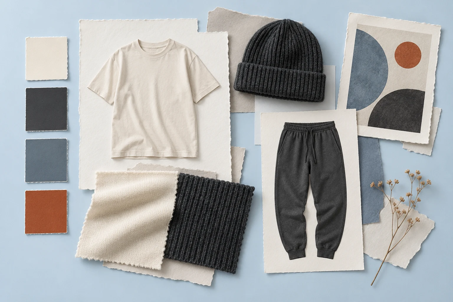
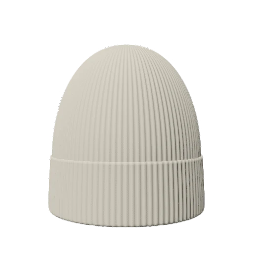
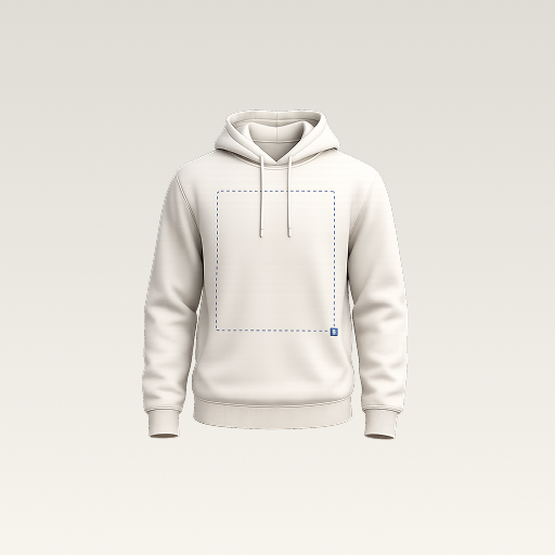
 mockup
A useful streetwear design idea gives you a decision to test, not just a style to copy. Start with your own words, symbols, or illustration and change one compositional rule at a time. These five exercises help you explore hierarchy and placement while keeping the artwork recognizable as your own.
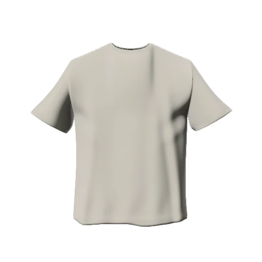

Build a clear concept before adding more effects. Compare each idea on the same garment and keep the strongest version for further artwork work.
1. Make one word do the work
Choose an original word or short phrase that belongs to the project. Create two versions: one compact and one deliberately more expansive. Use size, spacing, and the relationship to the neckline to create hierarchy before adding texture. A short phrase can feel very different when it occupies a quiet chest position or becomes the main front graphic.
Keep the letters readable at the size of the exported image. If you need distortion or heavy outlines to make the composition interesting, compare a plain version beside it. The question is whether the treatment reinforces the idea or conceals weak lettering. Keep the source type editable until you have chosen the direction.
2. Build a small symbol system
Start with a simple original shape or emblem and give it two roles: a small identifying mark and a larger supporting composition. Keep a consistent geometry or line weight between them so the two sizes feel related. You can test the same identity on a T-shirt and a beanie without assuming that all the fine details will survive both surfaces.
Check the symbol in a single color before making a complex palette. If its silhouette becomes unclear when small, simplify the shape or separate overlapping parts. Keep artwork preparation distinct from the mockup: the preview lets you compare the symbol’s role on clothing, while the source file remains the place to refine the actual drawing.
Test whether the identity works on a smaller canvas3. Give an illustration a deliberate frame
Take one original illustration and compare three boundaries: no frame, a simple rectangular field, and a looser arrangement with visible negative space. Use the same illustration scale at first so you can see what the boundary changes. A frame can make an image feel contained, but it can also turn an accidental background into a conspicuous printed block.
Check the actual file transparency before importing it. Do not assume a white rectangle is a design choice if it came from the source image. If you do choose a solid field, treat its shape and edge as part of the composition. The outer boundary should support the illustration rather than merely fill the available space.
4. Make the front and back have different roles
Try a quieter front mark and a more expressive back graphic, then compare the reverse hierarchy. Keep one shared element, such as a type treatment, color, or symbol, so both sides belong to one piece. They do not need to repeat the same image at the same size to feel coherent.
Use separate front and back previews during review. A dramatic angled shot can hide the most important part of one side. Write down what each view should explain, then choose framing that makes that information visible. Confirm the supplier’s actual decoration areas before treating a successful digital composition as a production layout.
5. Design with one accent-color rule
Choose one accent and give it a clear job: a single word, a small symbol, or one part of the illustration. Compare it with a version that uses only the base colors. This makes it easier to judge whether the accent improves the hierarchy or merely adds noise. Keep the garment color and lighting constant while comparing.
Once the accent has a purpose, test a light and a dark garment. A design may need a separate contrast version rather than the same colors everywhere. Name that variation clearly and keep the original palette in your source file. A screen preview is useful for visual comparison, but important fabric and print colors still need physical confirmation.
Build a palette and direction before expanding the ideaCompare the exercises on a garment, then edit the source
Use one available T-shirt in 3D Mockup as the shared canvas for your chosen exercises. Import the artwork, inspect its visual scale from the front and an angle, and export a small set of comparable concepts. Keep the views consistent so a collaborator can respond to the design rather than a change of scene. Studio access requires a subscription.
Choose one direction and return to the original artwork to refine the details. Check small lettering, transparent edges, and the source file’s dimensions at the intended print size. Save a brief explaining the chosen concept and what remains unresolved. Developing one clear idea usually produces a more useful next step than collecting many unrelated graphics and calling them a collection.
Check the original artwork before preparing production filesQuick answers
Do these exercises include ready-to-print designs?
No. They are prompts for developing your own artwork and evaluating its composition. Prepare the final files for the actual printer and product.
Can I create the whole illustration inside a mockup editor?
Use the tools suited to preparing your original artwork. In this workflow, 3D Mockup is the place to test how that artwork reads on a garment and export a concept.
Further reading
Further reading on apparel design. The five composition exercises above are original editorial prompts, not a catalog of downloadable artwork.
Published by 3D Mockup. These guides explain a mockup workflow, not manufacturing specifications. Studio access requires a subscription; AI artwork generation uses credits.