 mockup
A tote bag has a generous-looking front panel, but the handles, opening, seams, and bottom shape affect how much of it reads clearly. Start by deciding whether the bag should carry a quiet logo or a bold illustration. Compare those ideas on the same bag before spending time polishing backgrounds.
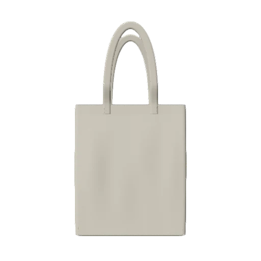

Judge the artwork against the usable panel, not the whole bag silhouette. Check a plain front preview before creating a lifestyle presentation.
1. Choose the bag shape before the graphic scale
A narrow book tote, a wide shopping bag, and a bag with a deep base do not present the same canvas. Compare the intended bag’s proportions, handle positions, and visible seams with your mockup model. If they differ, keep a reference photograph of the real blank beside the concept and describe the mockup as an approximation.
Think about the bag’s purpose. A compact mark may suit a subtle merchandise piece, while a single large illustration may be easier to recognize in a presentation. Neither is automatically better. Decide what the viewer should notice first, then judge the composition against that intention rather than trying to make every element equally prominent.
2. Prepare artwork that survives a fabric background
Use a clean source file with a transparent background when the design should sit directly on the fabric. A logo copied from a white web page often carries a white rectangle with it. Reopen the export on a darker background and check its edges before importing it. Preserve intentional white shapes inside the artwork.
Also check texture and contrast. A delicate line drawing can be attractive at full zoom but hard to read as a small product image. Try a simpler version before making the whole graphic larger. If the tote is black, inspect the darkest parts of the illustration; if it is pale, inspect light lettering and low-contrast details.
3. Compare three compositions, not dozens of tiny nudges
Create a centered graphic, a compact upper-panel mark, and one deliberately offset composition. These are design experiments, not universal production positions. Keep the same bag, camera, and lighting so you can compare the actual layout. Look at the space around the visible drawing rather than just the rectangular bounds of the file.
Check whether the handle attachments or opening compete with the artwork. Then inspect the lower edge and side seams. A design that nearly fills the entire front can look strong in a flat view but leave little visual breathing room. Save a version with more space around it and compare the two at normal viewing size.
- Centered illustration: check balance on all four sides.
- Compact mark: check whether it still reads in a thumbnail.
- Offset composition: make the asymmetry deliberate and repeatable.
4. Use the 3D view for questions a flat canvas cannot answer
In 3D Mockup, choose an available tote, import the artwork, and adjust the visible graphic on the bag. Inspect a front view and an angled view to see how close important details approach the sides. Keep the background quiet while you settle the design. The point is to make placement easier to evaluate on your phone, not to add effects to an unresolved composition.
A static model does not reproduce every fold or the way a loaded bag hangs from someone’s shoulder. Use the preview to narrow the options, then check the real bag where carrying shape matters. If the chosen mockup does not include the gusset or handle construction of your actual blank, that difference belongs in the handoff notes.
5. Make color comparisons fair
Choose a small set of fabric colors and export them with identical framing. Keep the graphic size unchanged unless a clearly labeled alternate design is needed for contrast. Otherwise you may end up comparing a larger logo on one color with a smaller logo on another without realizing it.
Name files by bag, artwork version, fabric color, and view. Reopen them together outside the editor and check the smallest intended viewing size. A short set of comparable images is more useful for a decision than a large collection of unrelated scenes. Keep any mood or campaign image as a separate presentation step after the basic design is approved.
Use a consistent system for variant previews6. Turn the chosen concept into a sampling brief
Send the original artwork, the selected preview, and the exact bag reference to the supplier. Ask for the product’s printable area, preparation requirements, and measurement references. The visible panel in a generic mockup is not a production template, and there is no single safe margin that applies to every tote construction.
When you receive a sample, inspect it flat and while carried with a realistic load. Compare the logo’s visibility, the fabric color, and the decoration finish with the intended concept. Record any changes before approving a larger run. The mockup helps you have that discussion clearly; the physical bag supplies the evidence for the final production decision.
Quick answers
Can I preview a black tote bag design?
Use a dark bag color and inspect dark outlines and small lettering with consistent lighting. Prepare an alternate artwork version if the design loses contrast.
What size should a tote bag logo be?
Choose its visual scale on the intended bag, then confirm physical dimensions against that product’s printable area. A generic mockup cannot establish a universal logo size.
Does this guide include a free tote PSD?
No. It explains a mobile 3D design workflow. 3D Mockup is free to download, but studio access requires a subscription.
Further reading
Supplier example showing that artwork is positioned within a product’s specific print area. Offers and minimums are not part of this guide.
Published by 3D Mockup. These guides explain a mockup workflow, not manufacturing specifications. Studio access requires a subscription; AI artwork generation uses credits.