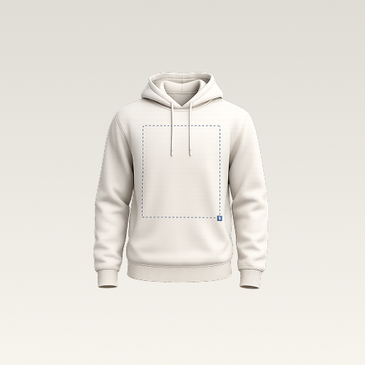
 mockup
A polo logo should look balanced beside the button placket, not simply centered in one half of the image. Start with the actual shirt style, choose a clear version of the logo, and compare two deliberate sizes. The mockup helps you choose the appearance; a supplier proof and physical sample confirm how it can be made.
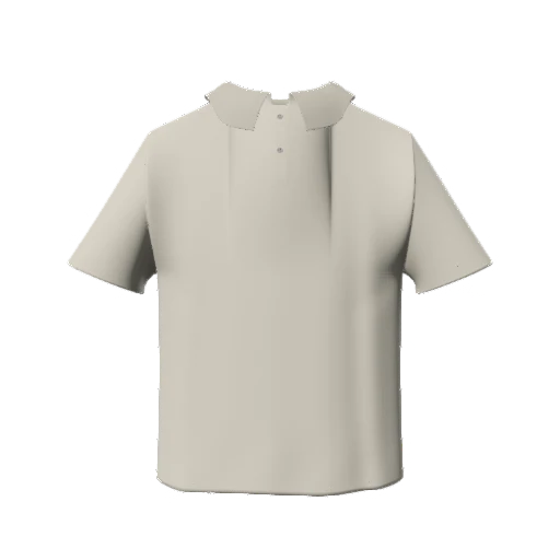

Use the collar and placket as visual references. Agree the logo side, size, and decoration method before approving a sample.
1. Read the shirt before positioning the logo
Notice the collar, button strip, shoulder line, and any chest pocket. These landmarks make a polo feel structured even when the rest of the shirt is plain. Start in a neutral color and compare the mockup with the actual blank you intend to order. Different pockets and collar shapes can change an otherwise identical logo composition.
Be precise about left and right. The wearer's left chest appears on the right side of a straight front-view image. In an approval brief, write wearer’s left rather than relying on a screenshot alone. If the project calls for the other side, label it just as clearly. This small clarification prevents two people from approving different interpretations of the same image.
2. Prepare a compact version of the mark
A full brand lockup may contain a symbol, company name, location, and small slogan. At chest-logo size, the slogan can become visual noise. Prepare a compact alternative with a clear silhouette and compare it with the full version. The goal is to preserve recognizable identity without depending on details that disappear in a small presentation.
Import artwork with a genuinely transparent background. Trim unnecessary transparent margins so the visible mark is easy to position. Check white details on a dark background and dark details on a light one. If removing the background has left a pale fringe, correct the original file before deciding that the polo color is the problem.
Clean up the logo background and edges3. Compare two placements with one camera angle
Try a restrained chest mark and a slightly larger version. Keep the placket, collar, and logo fully visible in both previews. Compare the distance from the visible logo to the button strip rather than its distance from the edge of the image. A wide horizontal wordmark and a square emblem can need different visual balance even when their selection boxes have the same width.
Keep the shirt, camera, and lighting unchanged while comparing. First decide the size, then adjust the position. If you change both at every step, it becomes difficult to explain why one version looks better. Save the chosen project before experimenting with a different color or an additional back graphic.
4. Separate the visual design from embroidery preparation
An image preview can show how a mark sits on the shirt. It does not determine stitch direction, density, backing, or machine instructions. Fine text and small gaps may need changes during embroidery preparation. Ask the supplier to review your specific logo at the intended physical size instead of treating a sharp image on a screen as proof that every detail will stitch cleanly.
Keep decoration choices open until they are confirmed for the actual product. Embroidery and printing produce different appearances, and availability depends on the selected blank and supplier. If the team is still choosing, show the same visual concept with a note that the production method is pending. Do not label a generic artwork overlay as an approved embroidery simulation.
5. Make a clear mobile preview
In 3D Mockup, choose an available polo, add the prepared logo as an image layer, and adjust its size and placement. Rotate the shirt to inspect the chest from the front and an angle. Use a plain background while deciding the logo position so the design remains the focus.
Export the selected concept and check the image in your phone’s gallery. Send one final front view and an optional angled view with matching framing. Keep alternate concepts separately named; a folder containing five different files called final makes approval harder than it needs to be. The app is useful here as a portable visual workbench while you refine the brief.
6. Hand off a brief someone else can follow
Attach the original logo alongside the mockup. Identify the blank, color, wearer-side placement, desired logo dimensions, and decoration method. Ask the supplier how placement should be referenced on that product and whether your smallest and largest garment sizes need separate review. Keep measurements in the supplier’s agreed system rather than estimating them from image pixels.
Request the relevant production proof and sample before a larger order when placement or finish matters. Compare the sample with the approved brief and record any adjustment. That gives you a useful reference for a reorder instead of relying on your memory of the first digital concept.
Quick answers
What is the correct size for a polo chest logo?
There is no universal size for every logo, polo, and decoration method. Compare visual options in the mockup, then confirm physical dimensions and production limits with the supplier.
Does a mockup turn my PNG into an embroidery file?
No. The PNG is visual artwork. Embroidery preparation and machine files must be handled through a suitable production workflow.
Further reading
Check your supplier’s current requirements for lettering, fine detail, and digitization.
Published by 3D Mockup. These guides explain a mockup workflow, not manufacturing specifications. Studio access requires a subscription; AI artwork generation uses credits.