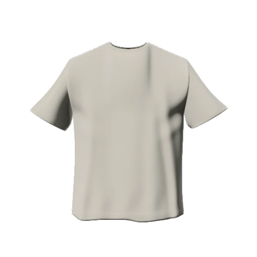
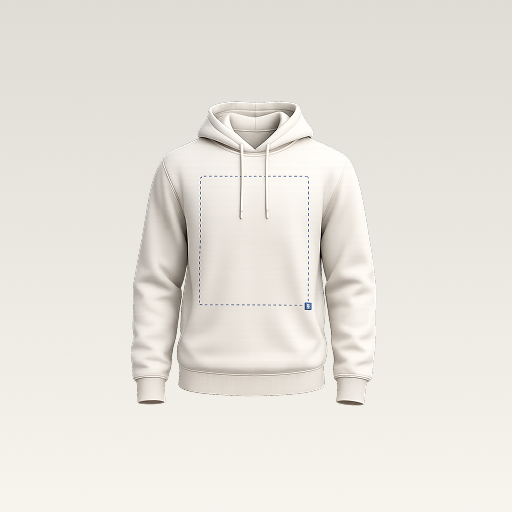
 mockup
A useful jersey mockup makes the identity easy to read: the team, the player, and the number. Start by assigning a job to each element, then test the longest name and a wide two-digit number before approving the layout. That catches problems a short placeholder name can hide.
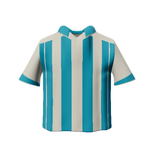

Build the design around a difficult roster example, not just the prettiest one. Keep names and numbers readable before adding decoration.
1. Match the jersey to the project
Decide whether you are presenting a short-sleeve sports top, a basketball jersey, or a fashion piece inspired by teamwear. Necklines, sleeve openings, and body proportions change the available visual space. A layout that looks balanced on a sleeveless model can feel crowded on a shirt with a narrow chest panel.
Use the closest available silhouette and write down the actual supplier reference separately. For an early club concept, keep a plain front view beside an angled view. The first explains the graphic; the second helps you notice how lettering approaches the side of the body. A generic model should be described as a concept when it differs from the intended product.
2. Give the crest, name, and number different jobs
Choose what should be recognized first. You might use a compact crest on the front and a much larger number on the back. If a sponsor line, team name, and illustration all compete at the same scale, the result becomes harder to understand. Reduce or remove a secondary element before shrinking every part of the design.
For the back, create a clear gap between the player name and number. Test the name as visible letters rather than relying on its text box. A short name can look centered while a longer replacement extends into the shoulders. Pick one alignment rule and apply it consistently instead of visually nudging each player into a different layout.
- One primary identifier on each view.
- A consistent baseline for player names.
- Clear separation between lettering and the number.
- Enough contrast to read the design in a small preview.
3. Stress-test the layout with difficult roster entries
Try a short name and the longest name in your actual roster. Then compare a narrow number such as 11 with a wide pair such as 88. These are layout tests, not rules for a particular sport. A design that works only with one attractive example is not ready to hand off as a team system.
If the long name fails, decide whether to reduce all names to one consistent size, allow a documented smaller size for long entries, or choose a more suitable typeface. Make that choice explicit. Keep a roster sheet containing exact spelling, capitalization, punctuation, and number strings. Treat 07 and 7 as different entries until the person approving the roster confirms which is intended.
4. Check contrast and construction separately
Look at the number at thumbnail size. An outline may separate it from the background, but several thin outlines can also make it muddy. First compare a simple light-on-dark or dark-on-light version. Add a pattern only after the identifier works without it. Do not use brighter lighting to hide poor artwork contrast.
Keep critical text inside a stable panel of the garment. All-over decoration requires the supplier's actual panel template, including safe areas and bleed; a perfectly continuous on-screen stripe does not establish seam alignment in production. If the project has competition-specific requirements, obtain them before final approval rather than inferring them from a mockup.
5. Use the mockup to settle the visual decisions
In 3D Mockup, choose an available jersey, import your own crest or graphic, and use image or text layers to explore the composition on your phone. Check the front and back at the same lighting settings. Export a clear preview once the hierarchy works, then reopen it outside the editor to inspect the actual shared image.
The useful app step is comparing the design before committing to a physical sample. It does not replace a roster-management system or promise automatic generation for an entire team. Keep the roster, original artwork, and supplier instructions as separate working files so a presentation export cannot accidentally become the production source.
Keep your team colorway previews consistent6. Ask for approval of a specific version
Send matching front and back previews with a version number. Ask the approver to confirm the exact text, number, garment color, and visual placement. A reply saying the design looks good is less useful than approval tied to a named file and a checked roster. If a name changes later, revise the proof rather than reusing the old approval.
Before ordering the full set, confirm the decoration method, dimensions, and product-specific requirements with the supplier. Review a physical sample where possible. The sample answers questions about fabric, finish, and real placement that a digital image cannot resolve.
Quick answers
Can I make a jersey mockup on my phone?
Yes. 3D Mockup has jersey models and lets you place artwork and text, inspect the design, and export a preview on iPhone or Android. Studio access requires a subscription.
Can I send the mockup as the jersey print template?
Use it to explain the intended layout. Send production artwork using the supplier's actual product template, and keep the approved roster separate.
Is this a free jersey PSD download?
No. This is a design guide for a mobile 3D workflow. It does not include a PSD template or a free studio subscription.
Further reading
Use the actual product template for panel boundaries and artwork preparation.
Reference for the limits of alignment across seams and closures.
Published by 3D Mockup. These guides explain a mockup workflow, not manufacturing specifications. Studio access requires a subscription; AI artwork generation uses credits.